Introduction
A “skillprint” is a unique, living artifact of skills and competencies, rather than a retrospective record of time spent & grades earned. Crafted in the form of a city tour guide, my skillprint highlights the projects (circa January 2020) that have formed my skills among intersecting disciplines.

"If your portfolio were a museum, your Skillprint is like the museum map. What’s the big picture snapshot that instantly orients people and informs them about who you are? What is the tool that helps translate you?"
This was our final project for my Introduction to Human Values in Design class. To me, this was an opportunity to represent my skills and competencies in a way a resumé or transcript simply could not.
Even after class concluded, I was compelled to refine my skillprint over winter break. It pushed me to articulate my past endeavors and my future goals. Moreover, it reaffirmed the vital role visual design would play in any of my future endeavors.
Inspiration and Brainstorming
The first thing I did was make a mind map. Thanks, David Kelley.


I organized my skills into three or four categories: design; math and physics; CS; and community involvement and/or leadership. I also brainstormed various metaphors for my design journey.
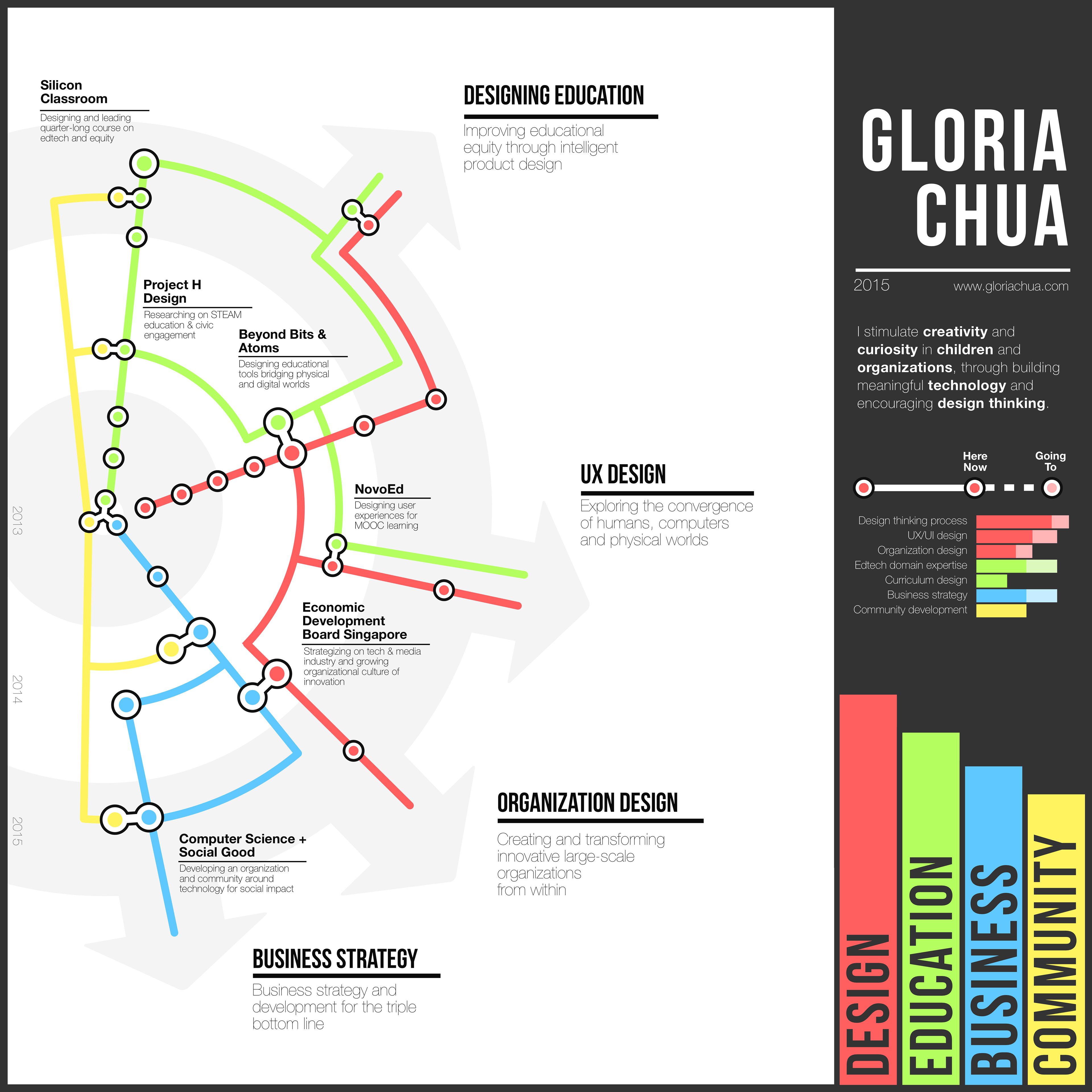
If I were honest with myself, I knew subconsciously that I wanted to make a map from the very beginning. My enthusiasm for transportation maps is clear if you've seen my dorm room, looked in my laptop bag, or read my Stanford college app essays. I was very inspired by Gloria Chua's skillprint, which was shown in class. However, I wondered: if I too was going to pursue a map, how was I going to make my skillprint unique?

While the form factor was important, I also realized this was also a challenge of information design. I began to list the information I wanted to place in my skillprint — skills, work experience, contact information, etc. — and came to this organization:
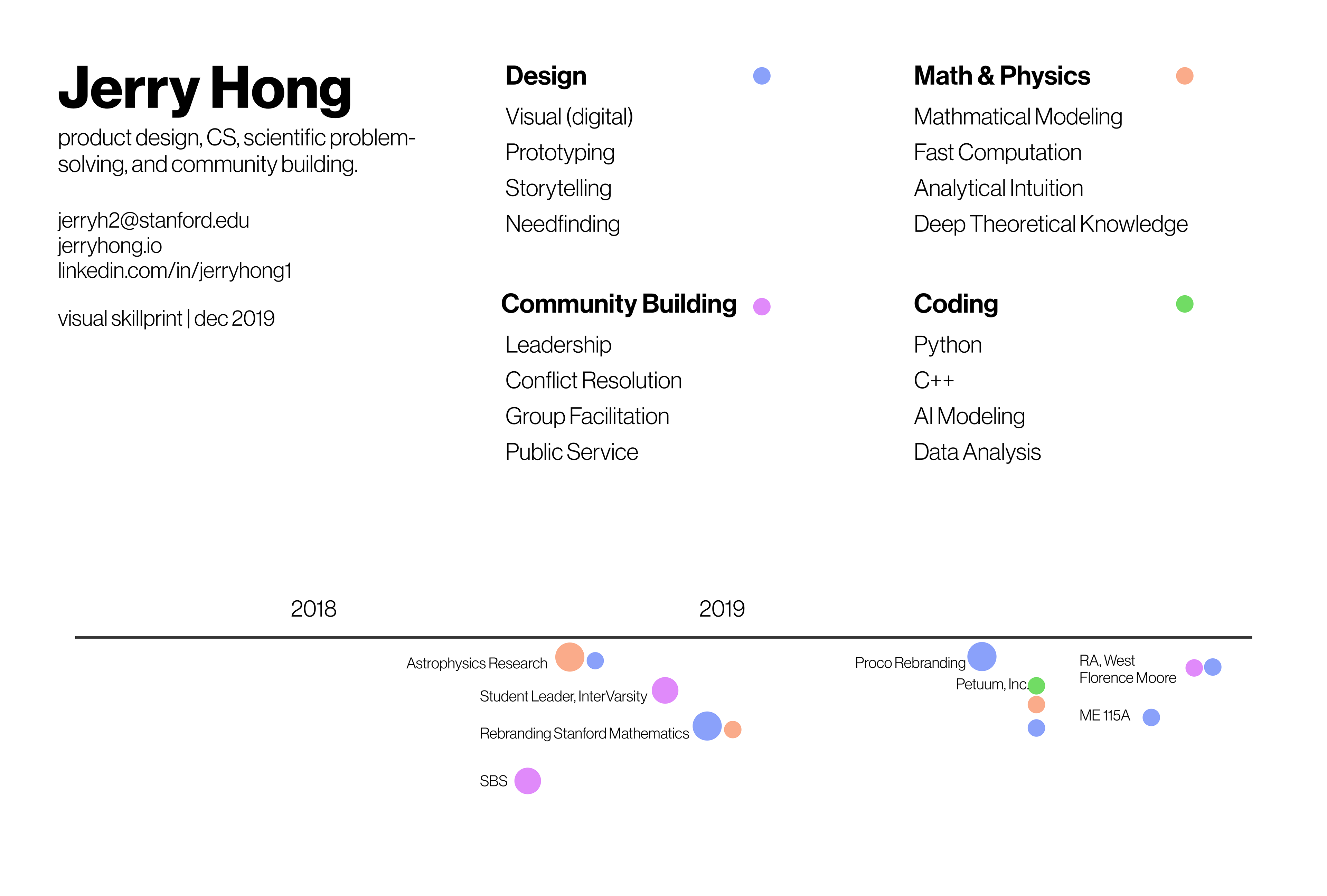
Already, the importance of intersection was coming out. Many of my past projects highlighted more than one of my core skills.
First Drafts
I came to class with three barebones drafts:
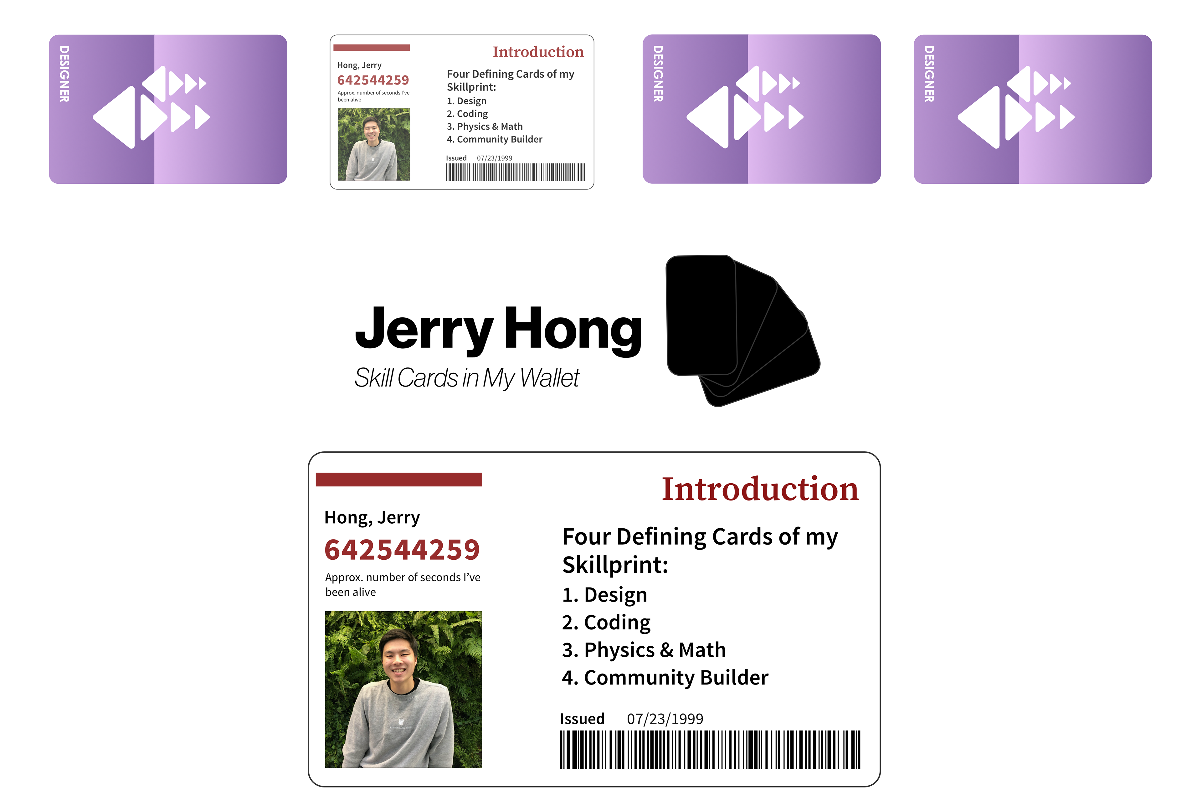
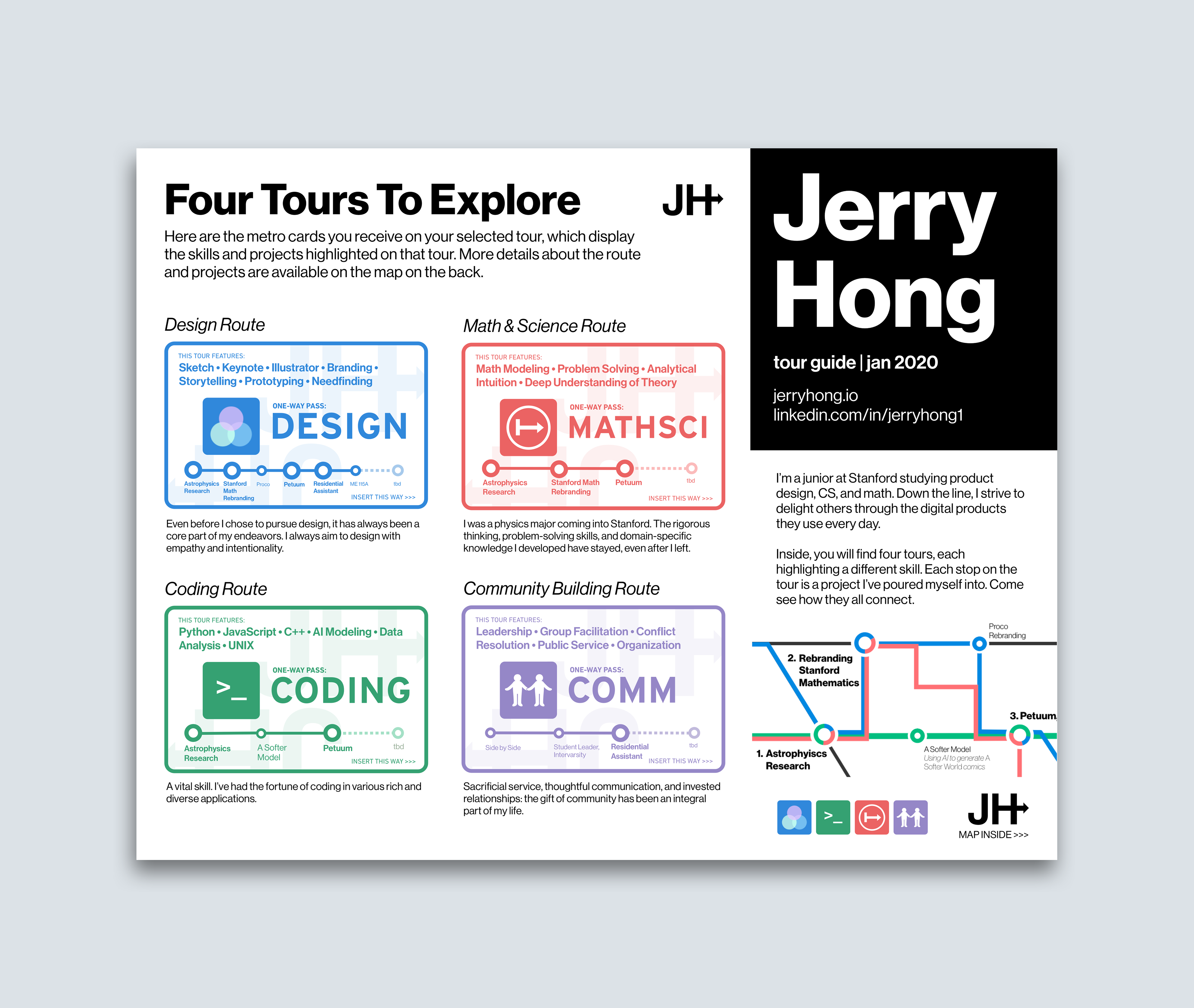
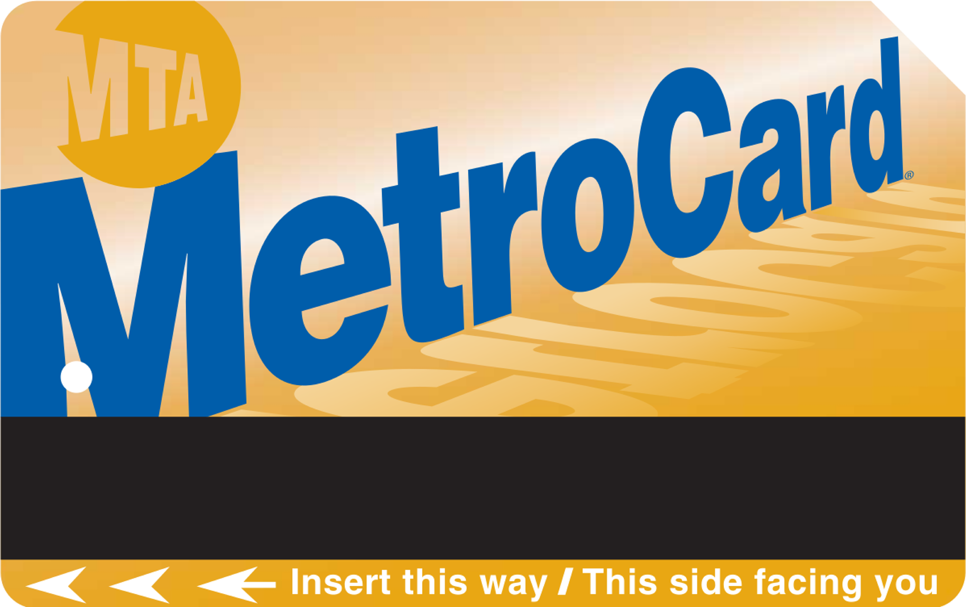
The first was a set of cards, the analogy being each "card" being a different skill which I possessed in my "wallet" and could pull out when needed. I had previously made digital parodies of common cards, such as my Stanford ID and Clipper card. But this idea already felt too discrete to me, not capturing the intersections of my skills.
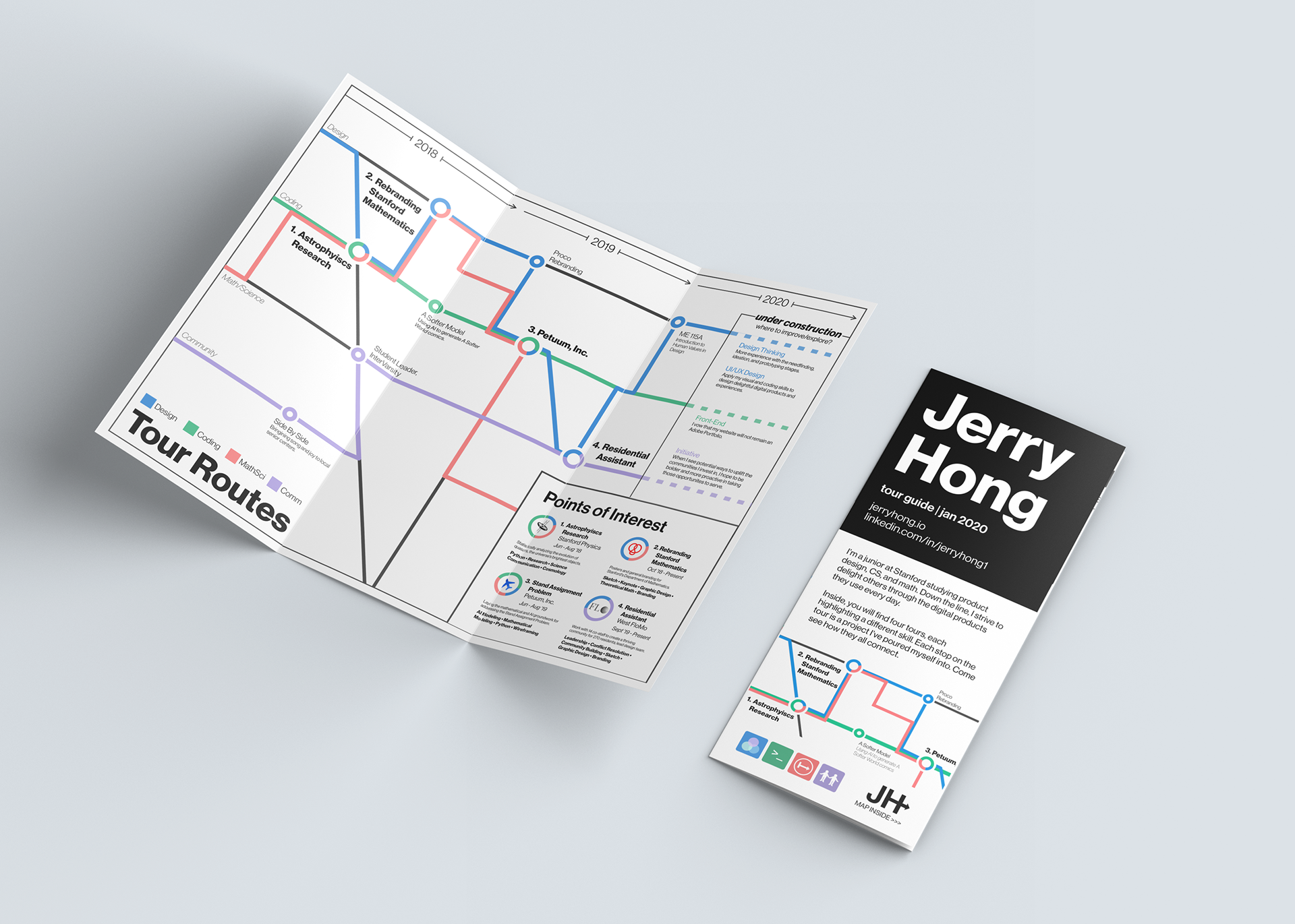
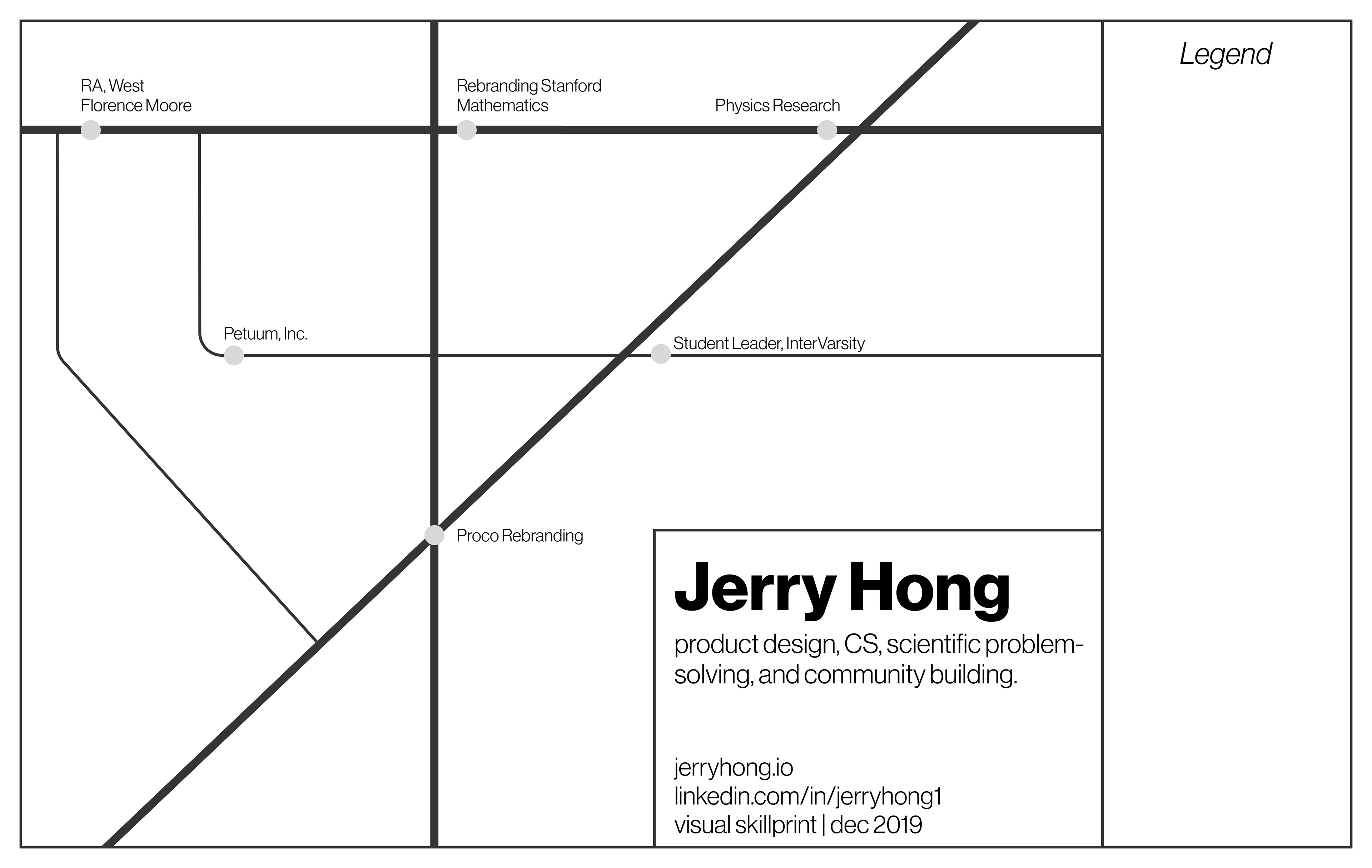
The second idea was the map. At this point, all I knew was that "stations" would represent projects/experience, and "routes" would travel through stations, with each route representing a different skill.
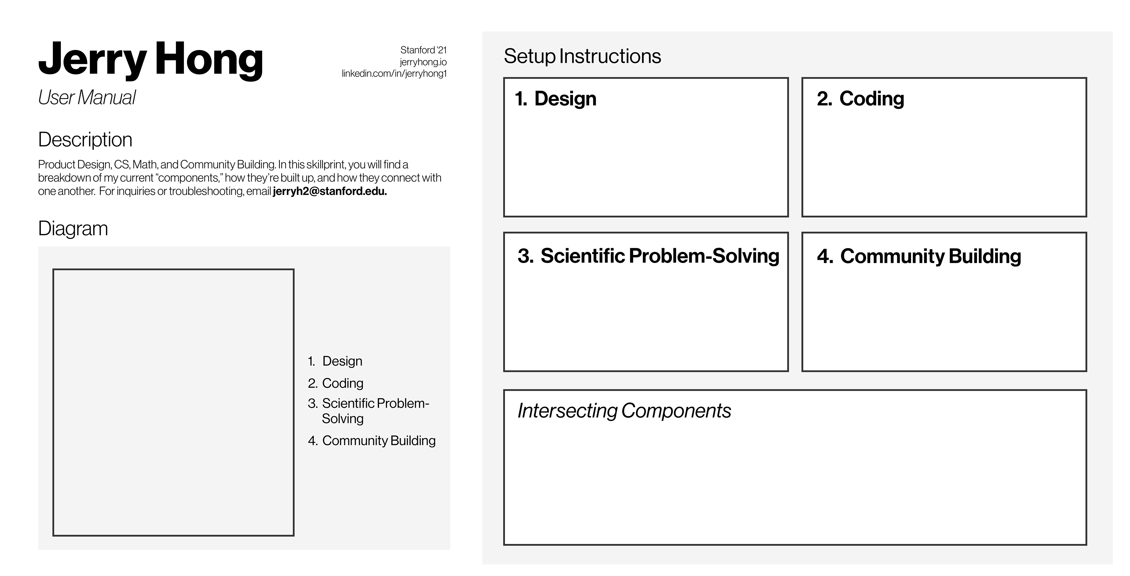
The third idea was a user manual, I loved reading user manuals growing up, but that idea also failed to organically demonstrate the intersections of my skills.
Feedback:
After talking with peers in the class, I realized my cards could serve their purpose in my map as metro cards.
Manish Patel, who had previously worked with Google Maps, provided impactful feedback about how the design could acknowledge its form as a physical brochure. I went home and immediately started folding a piece of printer paper into threes.

Second "Final" Draft
I left the day of feedback with the direction and inspiration to make my skillprint. I had two days to make my bare-bones first draft a full-fledged brochure.


I acknowledge and thank Tyler Packard and his role as a critic and advisor during these two days. Taking visual inspiration from the above sources, I divided the procedure into the following steps:
1. Decide on the general layout.
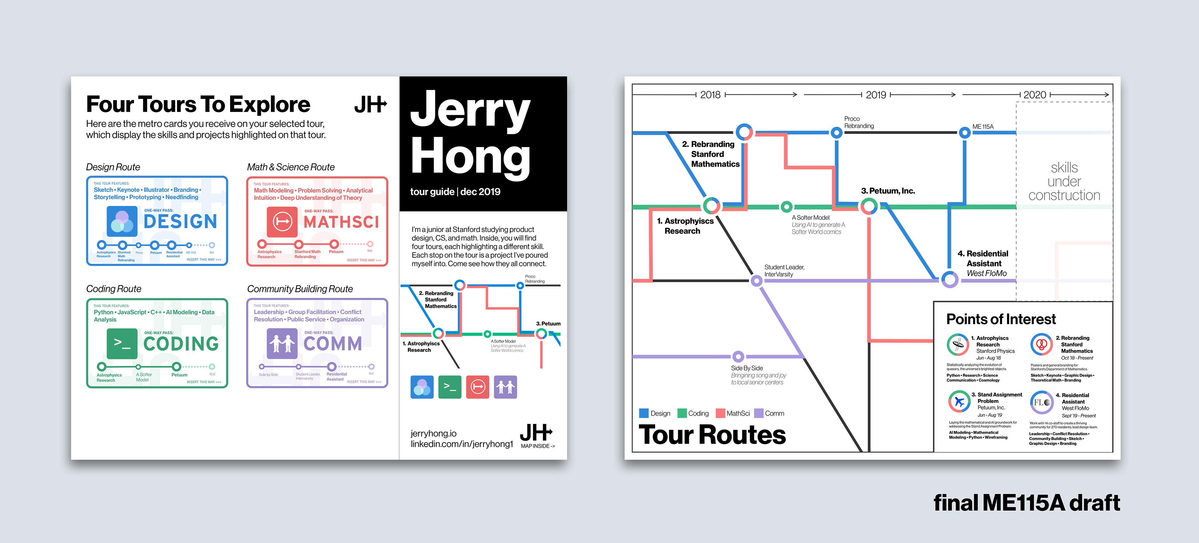
The back would have the map from the rough draft, depicting routes and stations; the front would have an introduction and a featuring of the four "routes," each depicted by a metro card. I almost put the introduction on the wrong side before printing. This is why you prototype physically!

2. Make the map.
I decided on organizing stations linearly by time, after also exploring radial and "tree-branch" style mappings.
I sketched a rough version of what the map might look like and drew some preliminary routes, each highlighting a core skill. I decided that stations with intersections could even house multiple colors, with the ratio of the color relating to how much each core skill was used in that station.
I also added a points of interest section to highlight and elaborate on particularly notable projects and experiences.
This is also where Tyler offered the idea of branding each route as a "tour," instead of simply four different subway lines.
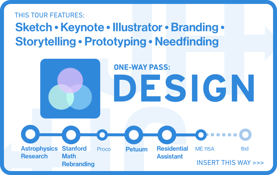
3. Design the cards.
One metro card per core competency, or "route". Each card features a logo, the skills associated with the route (e.g. Sketch for design), and a road map of the projects and experiences relevant to that route.
After a late night and some printing mishaps, I walked in a few minutes late with the printed skillprint below and a Sketch file to present to our class:

My second draft was well-received by others in the class, including instructors. The concerted effort I had put in was evident. But I wasn't done.
Refinement
Having presented my project in class, I wrote down some of the ways I could iterate on my current Skillprint:
Some of my friends, Melinda Wang and Josh Dong, provided some more feedback, too. Some of it was life advice.

I decided (along with pondering my life choices) that I would have two focuses for my refinements:
1. Egregious visual design errors, typos, and inconsistencies.
My folds were in the wrong place. And the bends of the routes should have curves. And the cards should have better spacing. And the logos should be consistently monochromatic...except the design logo, which is special.
2. Incorporating more important information.
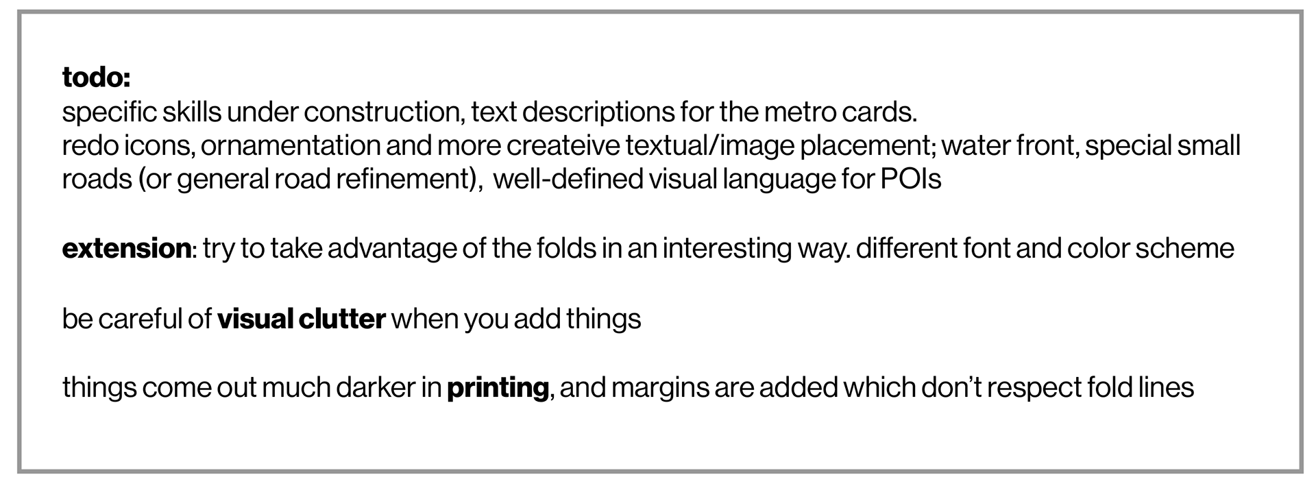
The skillprint would be hollow if I didn't properly elaborate on projects, skills, and most importantly, my current passions and future goals. The latter two especially were areas that I had not brainstormed for early on. I added descriptions for each card and the more minor stops. I specified some future directions I wanted to take in the "under construction" section (see image). And, I expanded my introduction.

There's always more to do.
I worked on this project to an extent that even surprised me. I am proud of the ways the final product satisfies the purposes of a Skillprint, highlights the complexities and depth of my competencies, and presents itself handsomely and creatively. I look forward to seeing how each "tour" develops in my life.

I decided before winter quarter that this project should be laid to rest. But, if I had more time, I would:
1. Fix the logo. It will serve me for many future endeavors to create a better personal logo.
2. Improve the visual "ornamentation." Better logos, texture, decorative borders, and perhaps even a different color scheme to make the skillprint appear more professional. And how do you maintain line thickness when the routes run parallel for multiple stations? It seemed logistically very difficult to do in Sketch.
3. Exploit the folds: If my skillprint is a physical, foldable brochure, could I take advantage of the folds creatively in my design? Perhaps a back part of the paper could connect with the front part with one fold, somehow.
4. Somehow, make it more editable. I wonder how manageable it will be to change the routes, cards, and points of interest in 2020.
Oh, and next time, I need to have colored pens more readily available. Sketching in monochrome is starting to get to me.