Introduction
"We’ve heard horror stories about Fix-It. Our health is being affected by these broken blinds.”
Stanford Fix-It is a frustrating, bare-bones service that is vital for students suffering from residential maintenance issues. After exploring how students and maintenance staff interact with Fix-It, my insights led me to design a more pleasant and empowering mobile app experience from scratch.
Role/Context
Individual 5-day Google Design Challenge + Partner Project for UI/UX course
Time Frame
Feb 2020 (15 days)
Discipline
Mobile UI/UX
Understanding the Problem
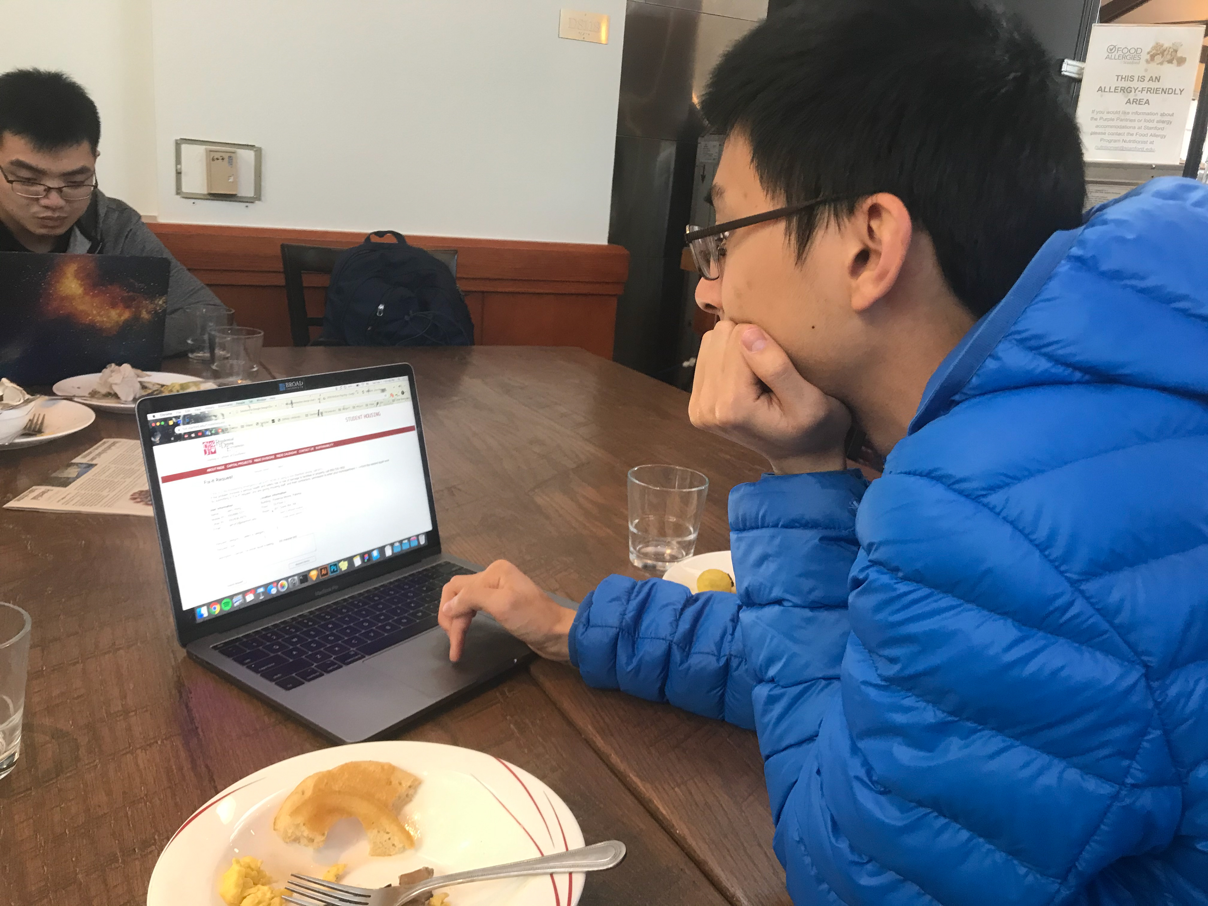
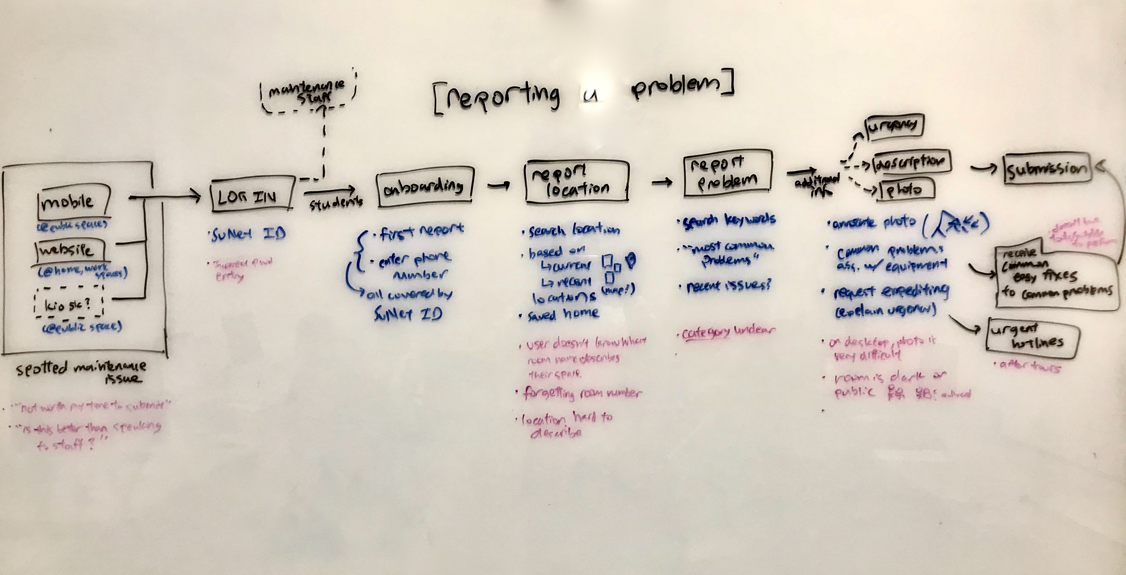
I interviewed 3 students in detail about previous experiences with Fix-It to gather what frustrated them about the process. I also observed each of them simulating a request submission to identify more pain points.
On the maintenance end, I was able to phone the executive director of residential maintenance operations & capital projects.
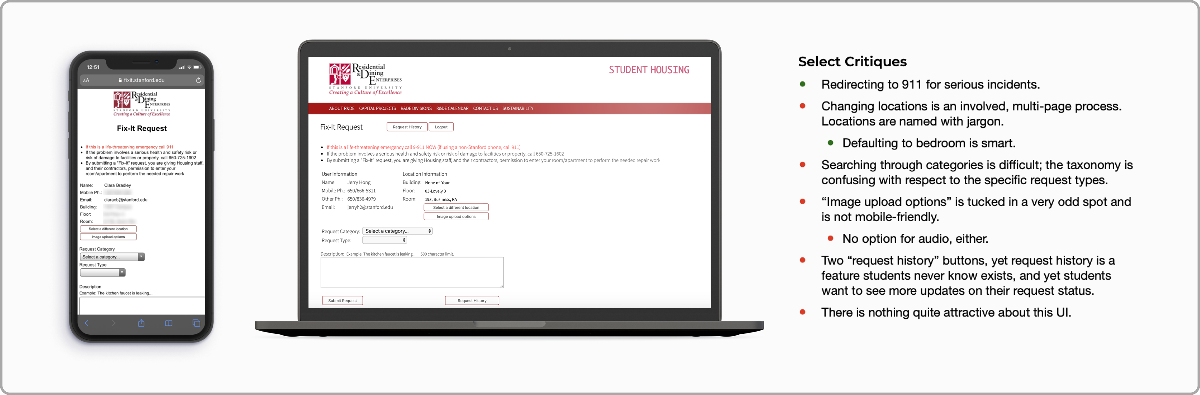
All the while, I performed own critique of the Fix-It website, from its visual interface quirks to its deeper usability issues.
Key Pain Points
Difficulty submitting media
Maintenance benefit greatly from audio and video, but students struggle to submit from laptops and intimate locations.
Lack of transparency and agency
The status and progress of a students' request are often unclear after submission.
Poor category discoverability
Students struggle to find the specific name of the problem they need fixed.
Lack of ownership
(For future exploration) How could we encourage students to help maintain upkeep of more public facilities like libraries?
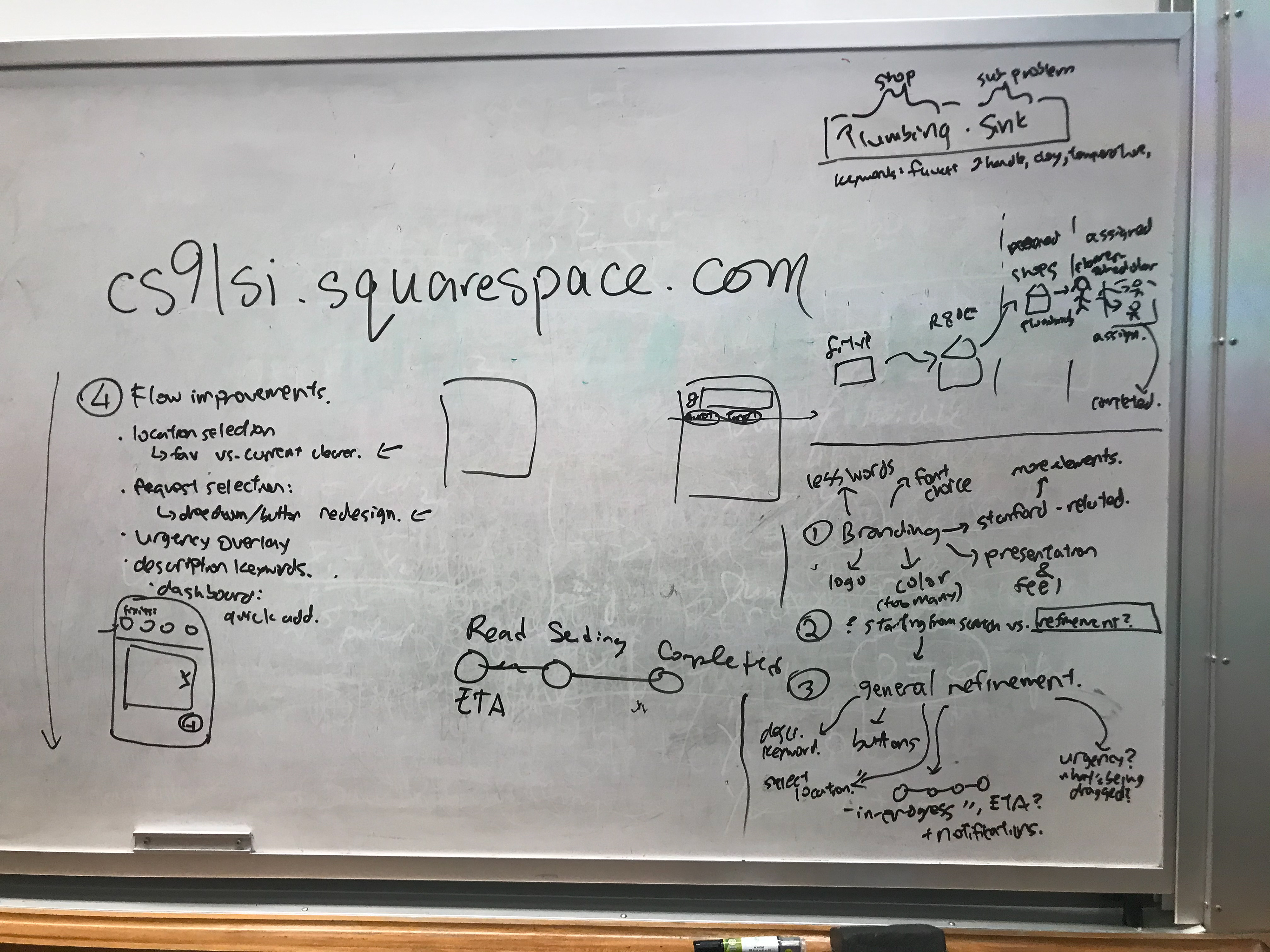
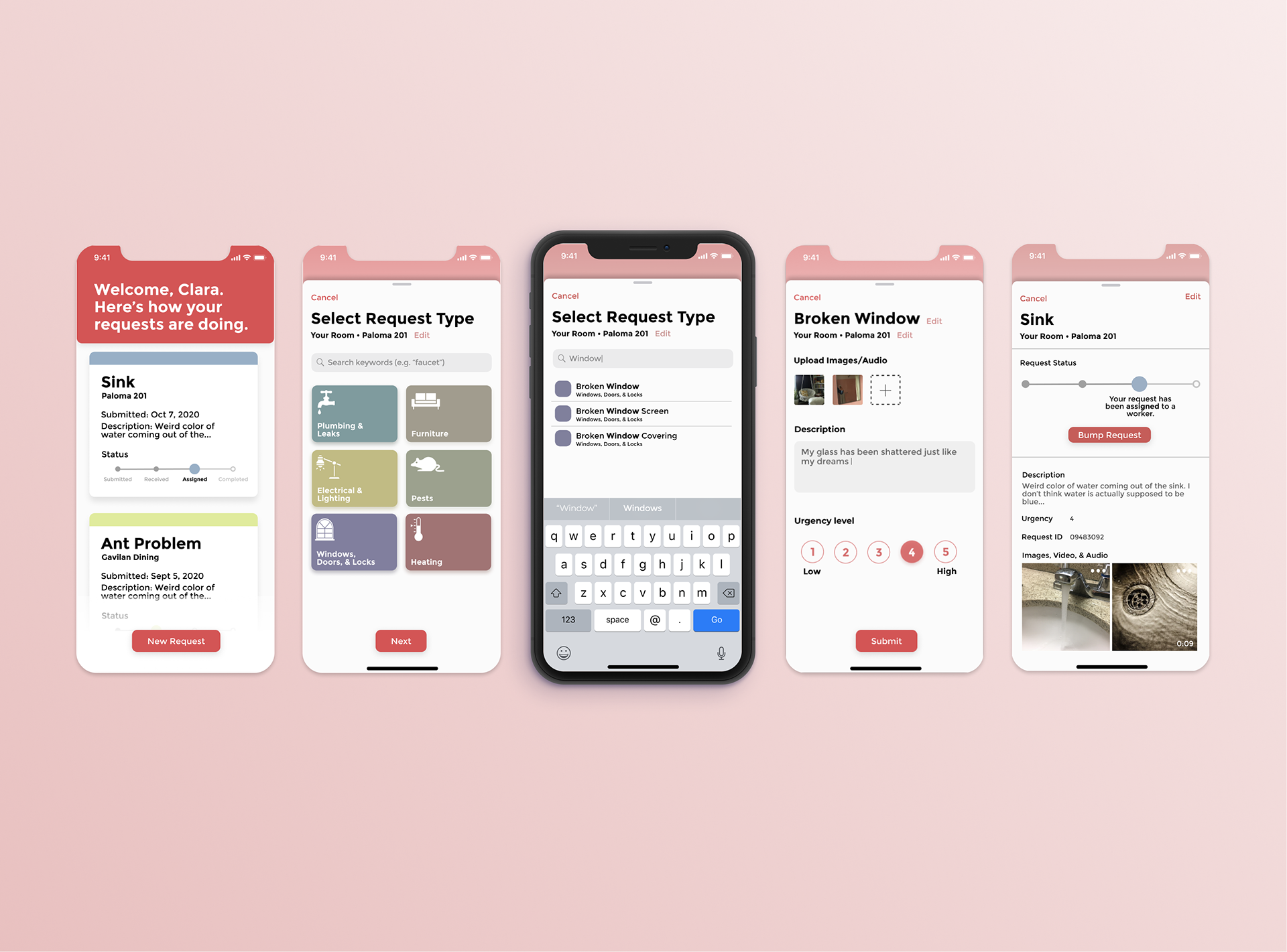
A Native App
Given the high priority of audio and video submissions, it was essential that a Fix-It redesign integrate tightly with students' mobile devices. Designing a native app experience became the clear option.
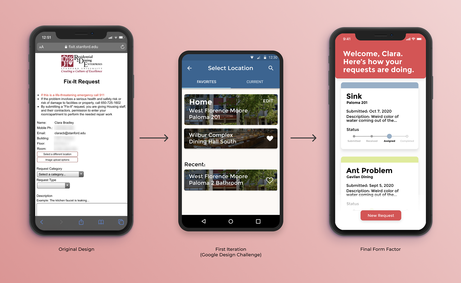
Progression from the original design, to a first rapid iteration (my first UI/UX mocks ever), to its final form factor.
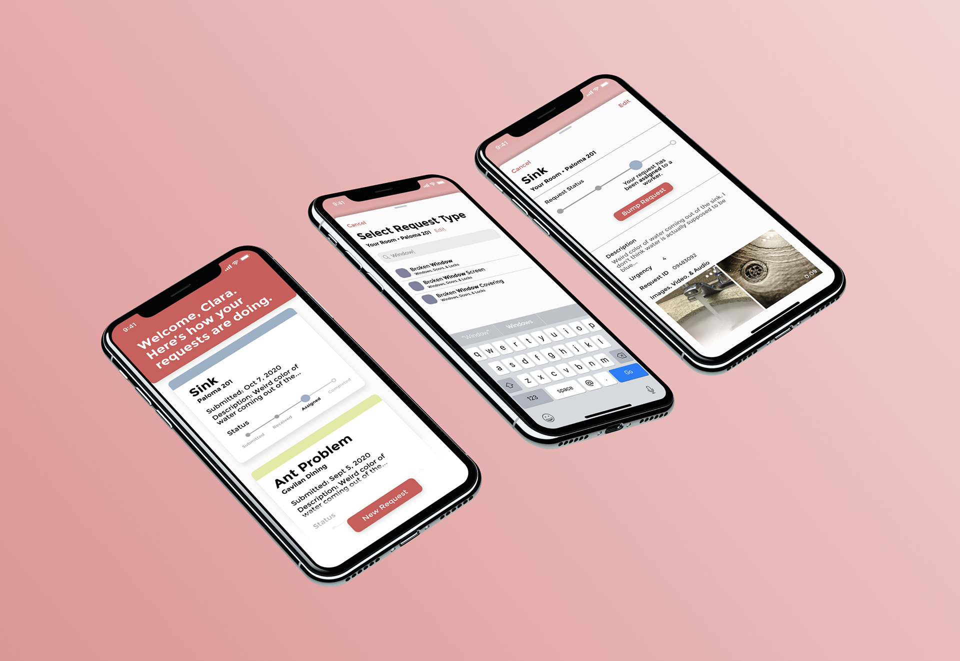
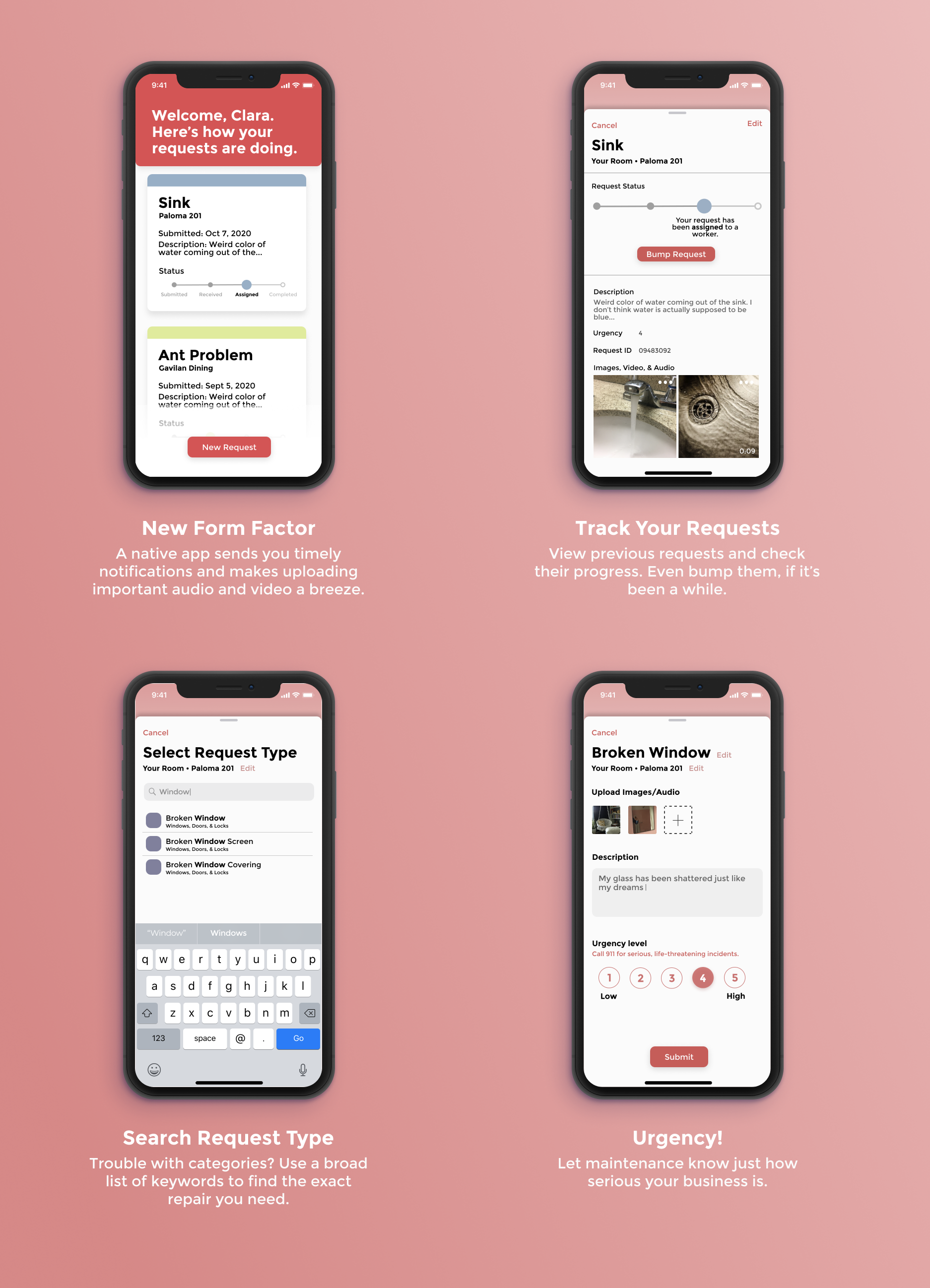
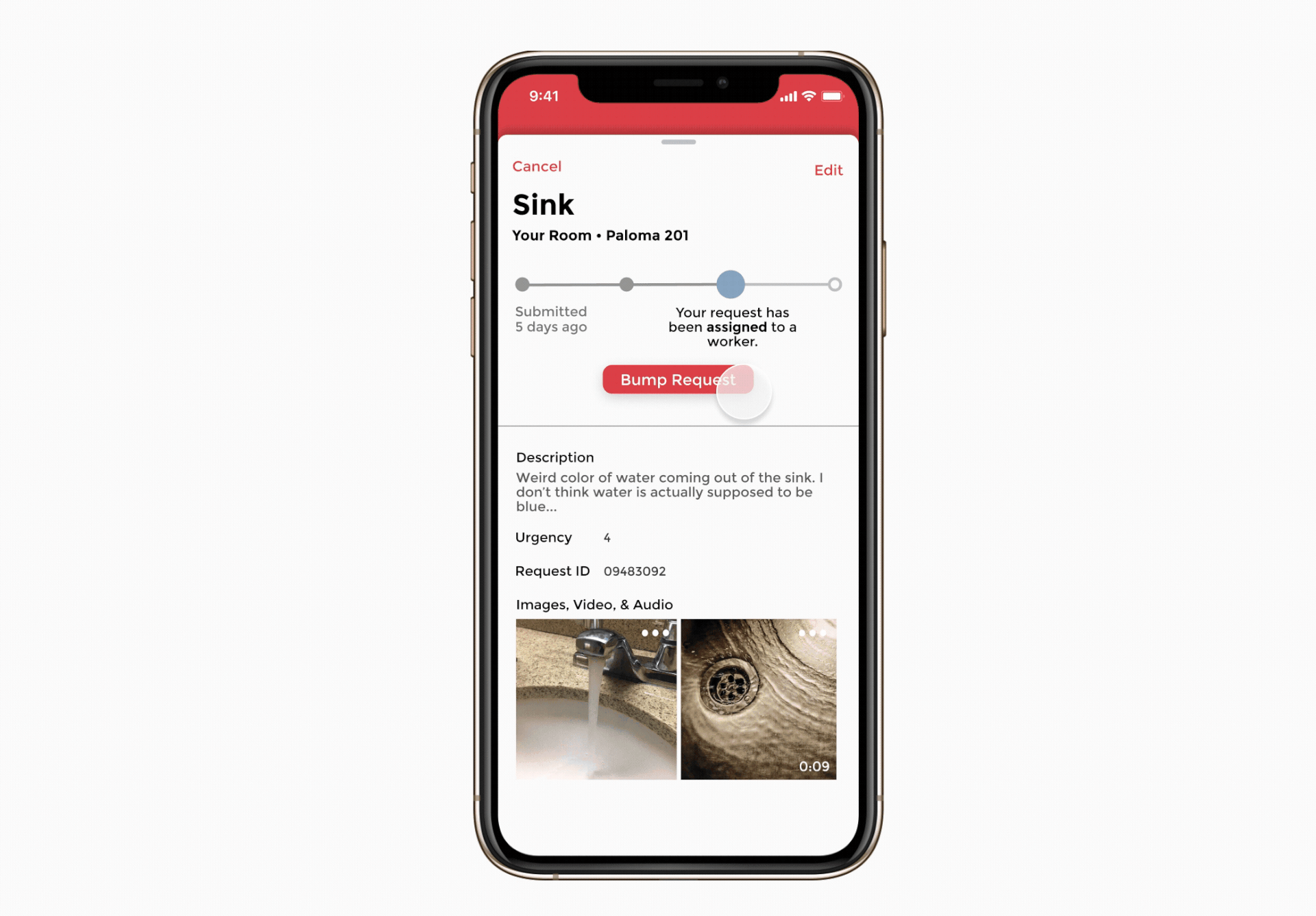
Tracking Submissions
The home page of Fix-It immediately surfaces in-progress requests, allowing users to see all the relevant status reports at a glance.
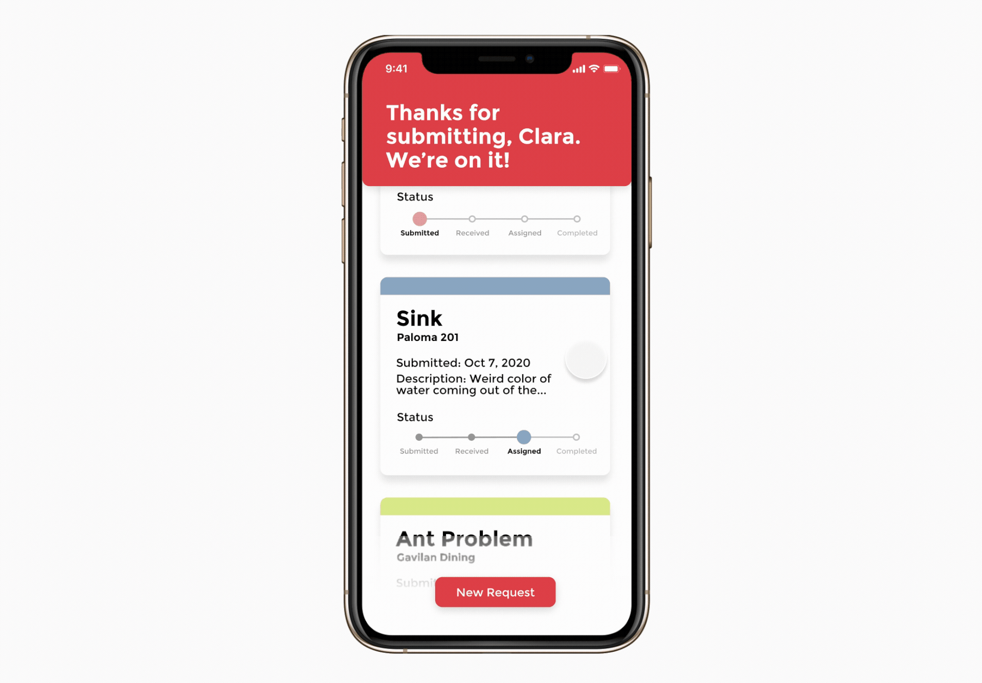
Individual requests can be viewed in more detail, edited, and "bumped" if the issue has become more urgent.
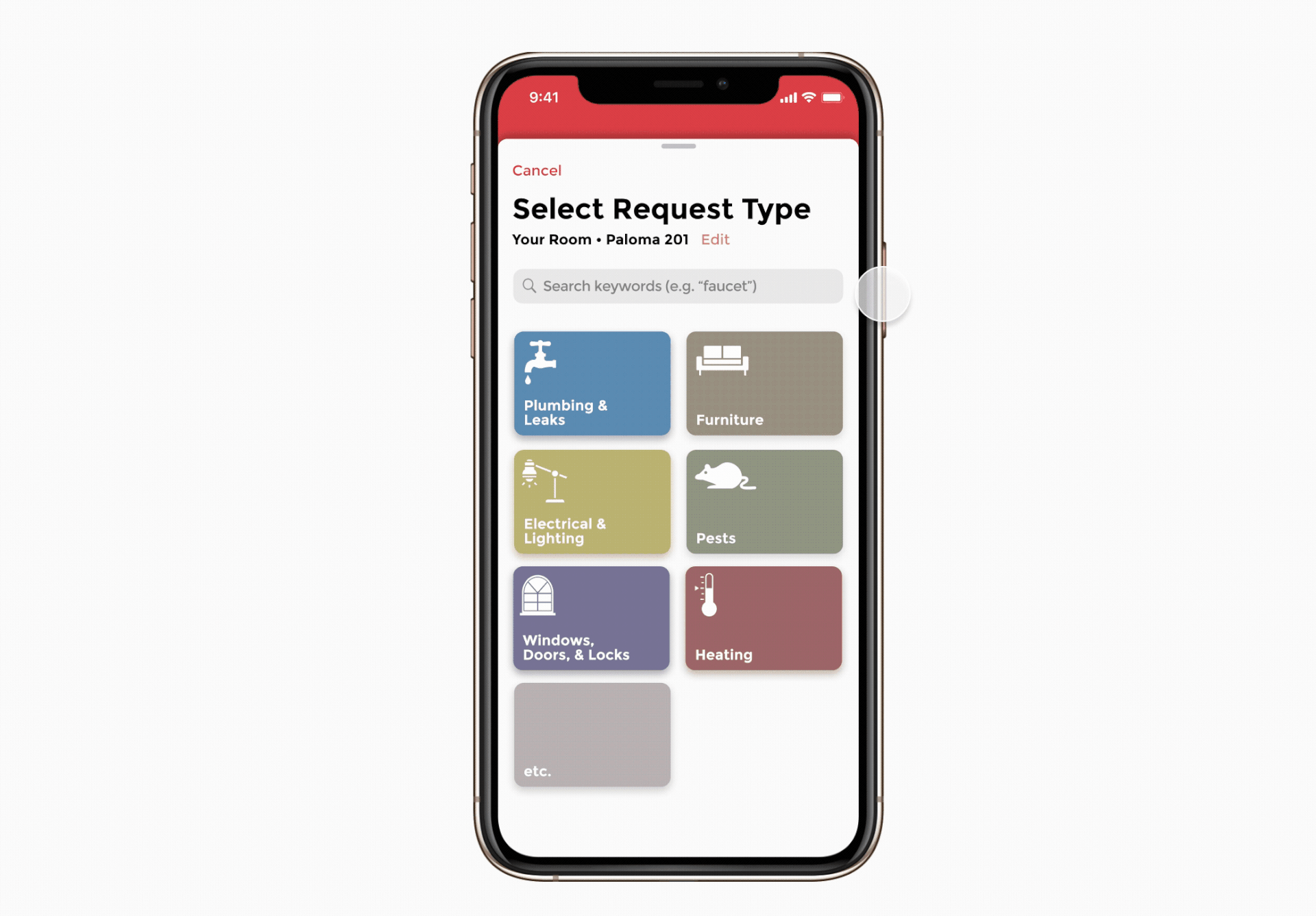
Creating a Request
To know how to process your submission, Stanford R&DE needs a "request type" to accompany each Fix-It request. Along with new icons and simpler category names, a "fuzzy search" allows users to discover this request type with ease.
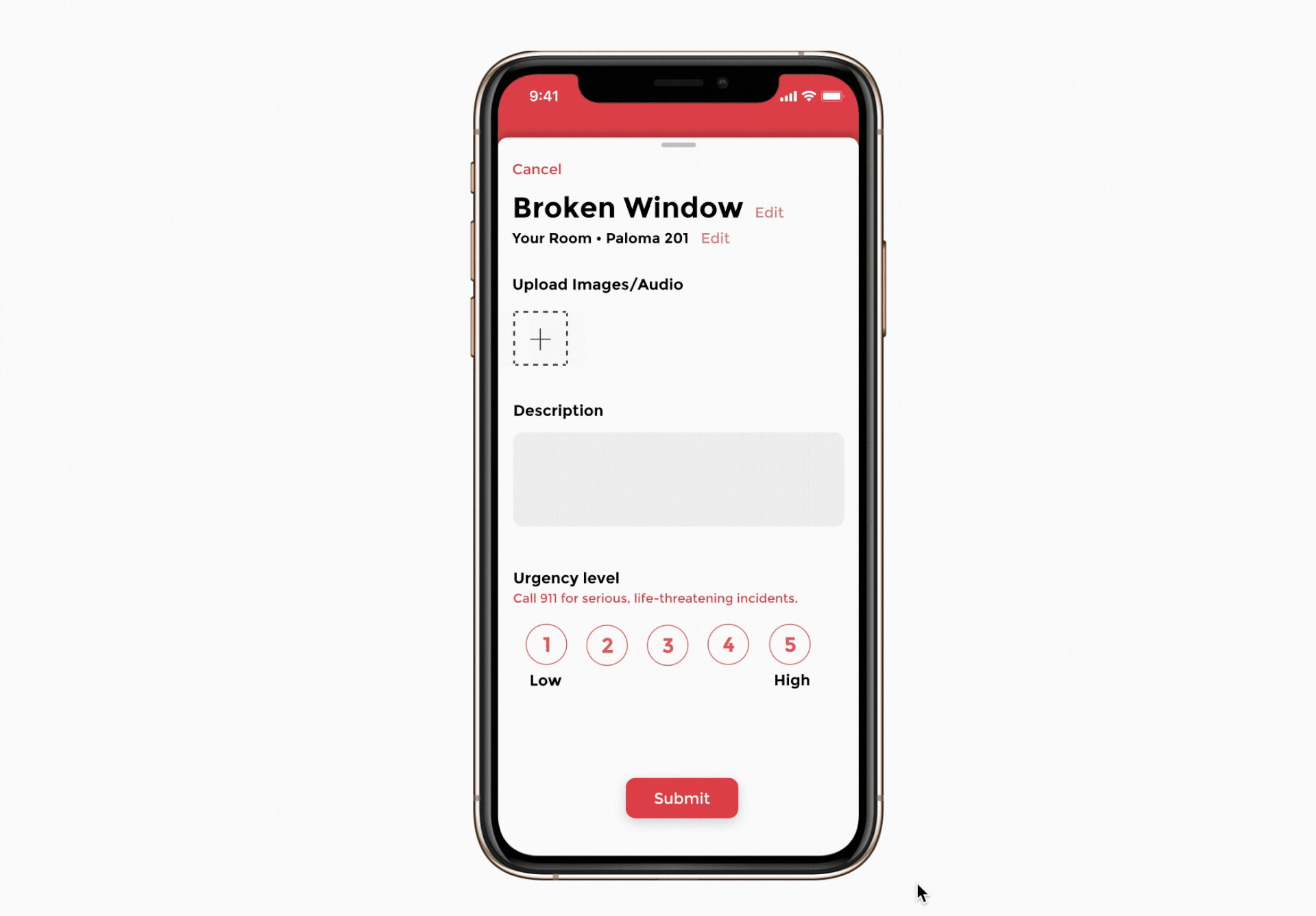
A final page gives users the space to add descriptions, media, and a new urgency level.
Conclusion
This was a surprisingly enlightening exploration of maintenance at Stanford for what just supposed to be my introduction to UI/UX. Projects like these deserve more than a couple weeks, and I learned for future fast-paced projects to narrow my scope earlier and allow myself to implement features I was still questioning to test with users.
If I were to do this again, I would design a UI more conformant to Apple's HCI guidelines and flesh out a pleasing onboarding experience.